EDIT: Fixed spelling errors and changed text slightly according to what was recommended.
This new layout is giving me some difficulties but anyhow! This is a little late thanks to some technical difficulties stopping me from accessing my folders with the work inside.
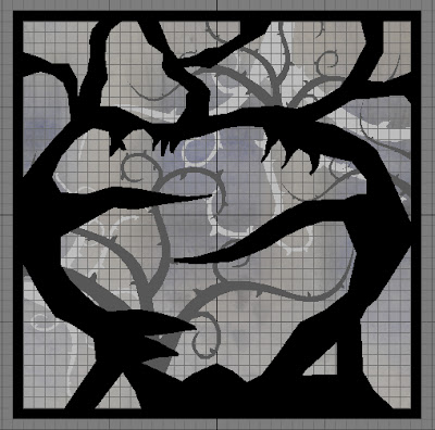
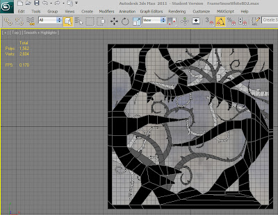
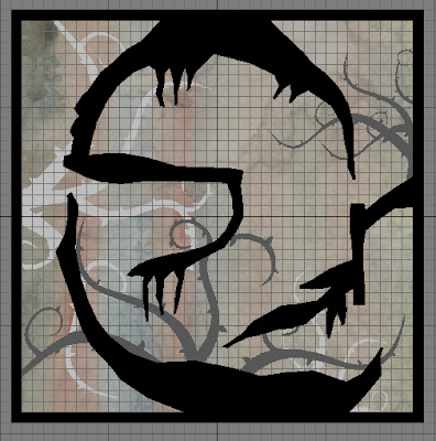
The main thing I want to ask people is if the silhouette's are alright, the text can be easily edited and I left the background blank for now but I think it'd look good with some really bright and solid colours behind the pictures. What do you guys think?
Also, this is an attempt to explain the story so far but I was worried it was becoming too much, not sure if it needs more or less so let me know.
Lastly, Kalveer I am trying to comment on your posts but Blogger seems to think I'm not logged in (been happening for a while) I'm liking the lighter background layers and I think they work a lot better now that you can clearly see it's not the same colour as the fore-ground.
From left > right, top 2 then bottom 2 :)